Grant Custer
designer & engineer

Slowly going out on a limb
About
I'm a designer and engineer focused on new and alternative interfaces. I specialize in prototyping and I love to work iteratively through a design in code.
Finding the right primitives for exploring a system is one of my favorite challenges.
I've built interfaces focused on spatial thinking, machine learning models, and data visualization. I like to work on small, collaborative teams.
Work
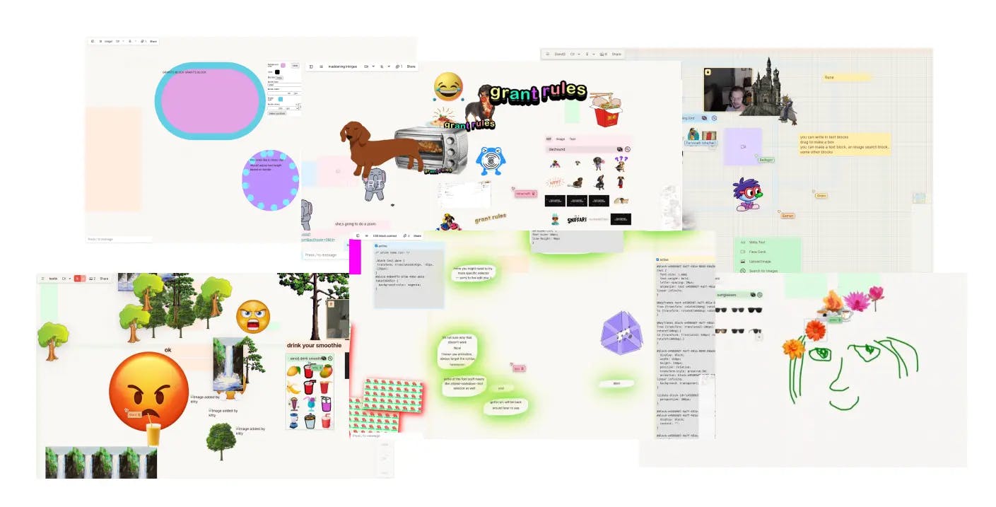
Prototyping interfaces for interacting with large language models. Going beyond chat. Focused on increasing our understanding and control.
Creative technologist
2023-Present
2023-Present
Experimental web-based creative tools. Featuring image distorters, freeform text editors, and weird website builders. Targeted experiments in alternative interfaces.
Creator, designer and engineer
2019-Present
2019-Present
Featured
Flow
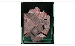
An experimental image editor that lets you set and direct pixel-flows.
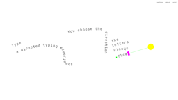
A directed typing experiment. You choose the direction the letters should flow.
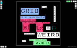
Adjust the grid size and text direction to create weird and expressive layouts.
Prototyping a new flutter-based tablet operating system focused on deep work. Trying to rethink things from the ground up.
Software engineer
2022-2023
2022-2023
Virtual spaces where you can meet, collaborate and play. I led engineering on features like drawing and screenshare, and built prototypes for experimental features like card stacking.
Engineer
2022
2022
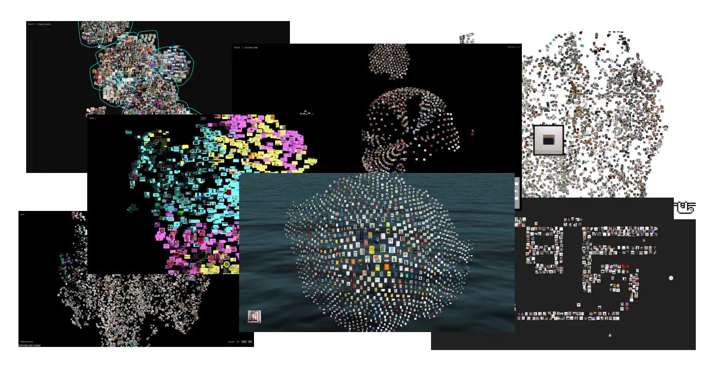
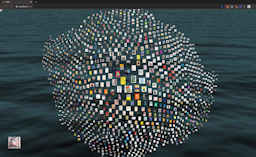
A better system for image organization. I led front-end engineering for the first versions of an experimental interface that lets you browse and make connections between thousands of images. We used WebGL to build a reactive, intuitive way to explore images clustered through machine learning.
Front-end engineer
2021
2021
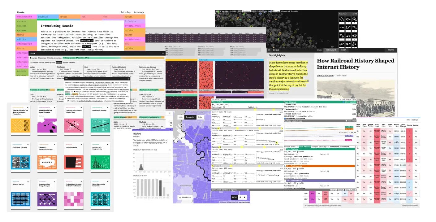
A research lab. We built quarterly prototoypes exploring machine learning capabilities. I designed and built the front-end for experiments exploring capabilities like summarization, sentiment analysis, and prediction. I also led design for the branding and print reports.
Designer and engineer
2014-2021
2014-2021
Featured
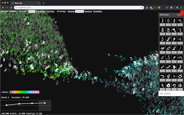
Active Learner
An interactive visualization of active learning data labeling and how it affects a model.
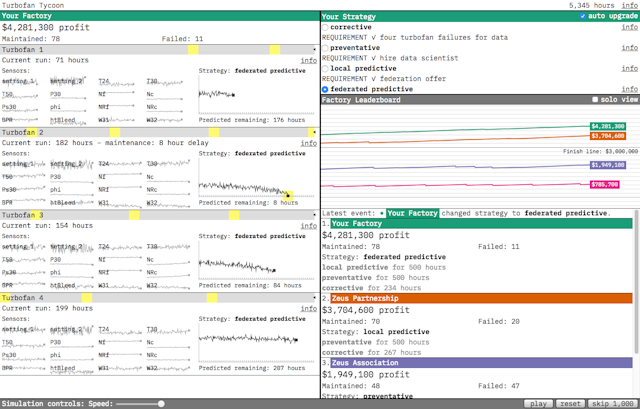
Turbofan Tycoon
A federated learning demonstration in the form of turbofan factory simulation game.
Textflix
Sentiment analysis of movie review visualized and compared across different models.
Worked on many early-stage prototypes and experiments, including Instapaper, Poncho, and Findings.
Designer and engineer
2012-2014
2012-2014
More
@grantcuster
Work and inspiration in progress
@grantcuster.vis.social
Grant Custer
Homepage
2023
World Wide Web